


Master English
The beginning
When I joined WordDive, they were preparing to launch a new product, which later became Master English. One of my first tasks was collaborating with the Lead Visual Designer to create the new brand.The project involved creating Master English, a new language-learning app and brand developed by WordDive. Using unique AI technology, the app delivers a personalized English study program tailored to each user’s pace, needs, and skill level. I collaborated closely with the Lead Designer and CMO to shape the visual language of Master English.
UI/UX design, Visual Design, Branding, Prototyping, User flows
Photoshop, Adobe Xd, Illustrator, After Effect
Shaping the brand
We launched the project with thorough market research and crafted the brand identity using the brand archetype method, validated through ad banner tests across target countries. After analyzing the insights and conducting multiple rounds of testing, we strategically narrowed our focus to Central and South American markets, with a particular emphasis on Mexico, to maximize impact and relevance.
Users feel language apps lack proficiency and business-ready English, while private lessons are seen as effective but difficult to commit to due to scheduling challenges and high costs.
Most language apps focus on beginner and intermediate levels, with few supporting advanced English learning.
Many in Central and South America want to work in the USA to advance careers, but face language barriers.
Focus on individuals seeking English proficiency for career advancement, particularly in Central and South America, aiming for opportunities in the USA.
Differentiate the app with a serious, motivational approach that resonates with users’ professional goals and learning ambitions. We emphasized the real challenges of learning a language through ad campaigns and branding, reinforcing a tone of commitment and authenticity.
Defining the Brand’s Visual Language
At the same time as conducting market research, we began defining our brand’s visual language.
We started by creating style scapes to narrow down the visual direction and ran internal surveys to see which concepts resonated most.
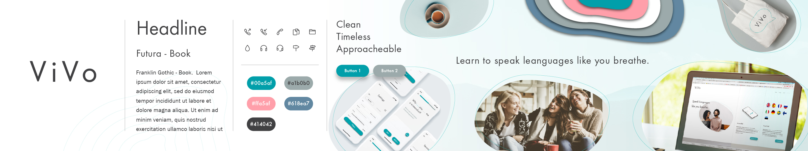
A style scape is a visual tool used to explore and define the aesthetic direction of a brand. It combines various elements such as colors, typography, imagery, and textures to create a cohesive visual narrative.
These surveys also included voting on potential brand names.
Utilizing A/B tests
After narrowing the visual feel to four different designs, we conducted a multi-variant A/B testing (ads → App Store) across different countries to see which brand identity performed best in converting interest (install intent).
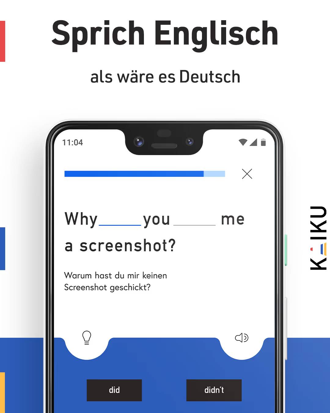


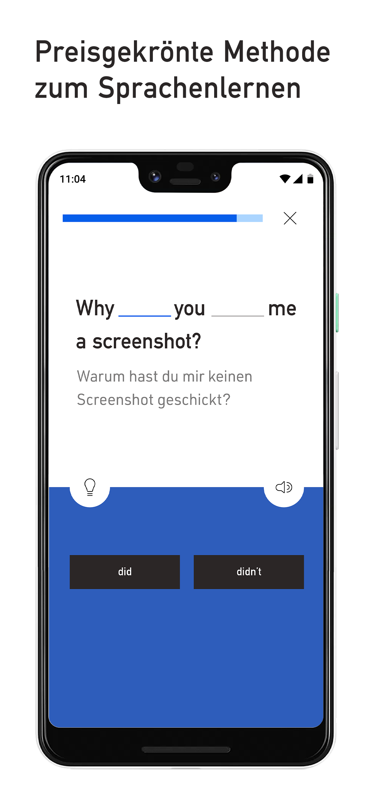
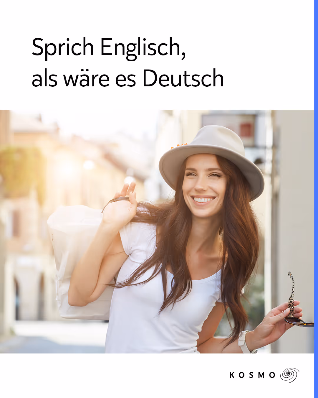
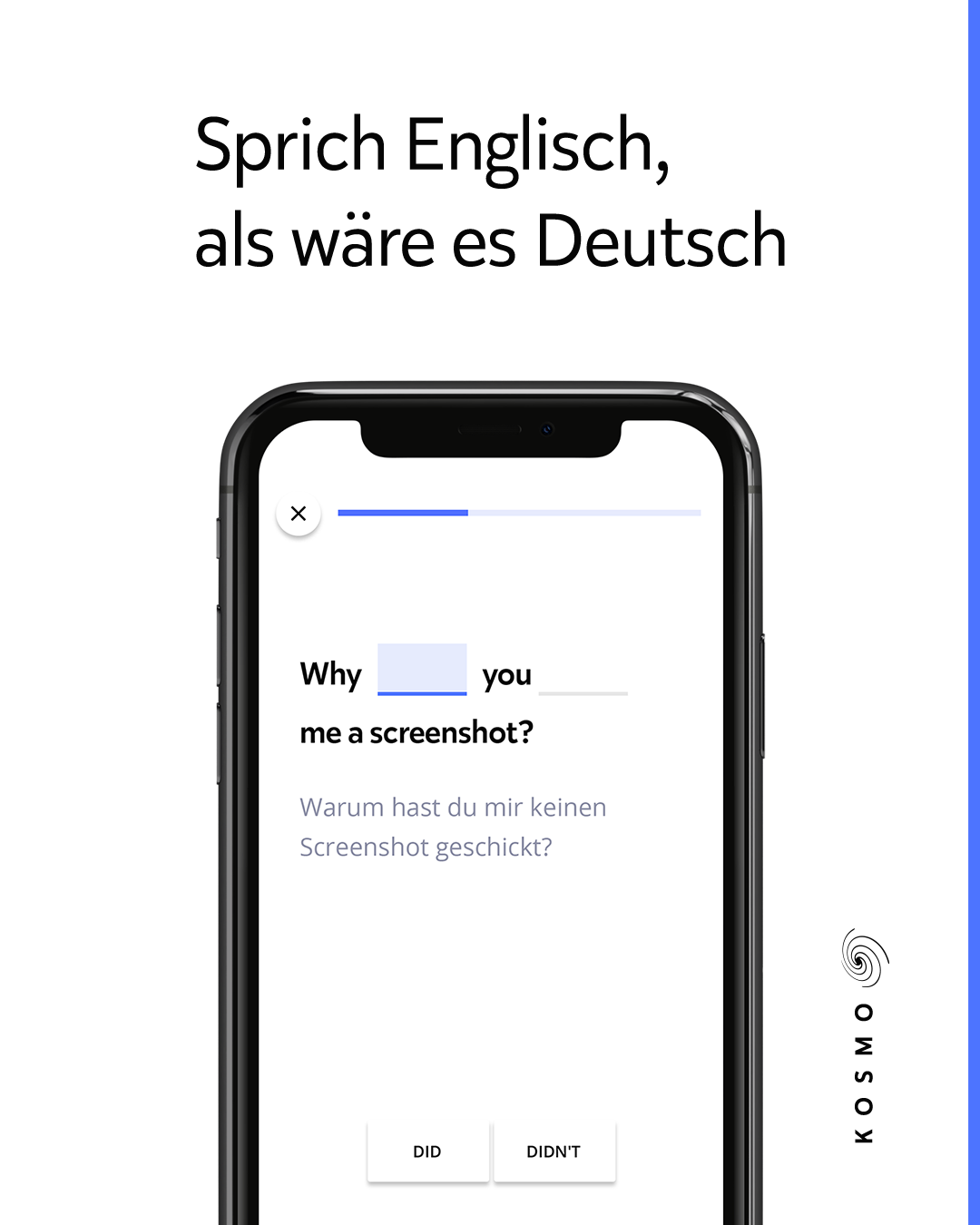
The idea was to test multiple ad types, one featuring a learning screen and another using lifestyle imagery, each adapted to the different brand variants we wanted to evaluate. Clicking an ad directed users to a corresponding mock App Store page, where we measured not only ad CTR but also which brand direction drove the strongest conversion intent. This allowed us to see which creative and brand identity resonated most in each region.
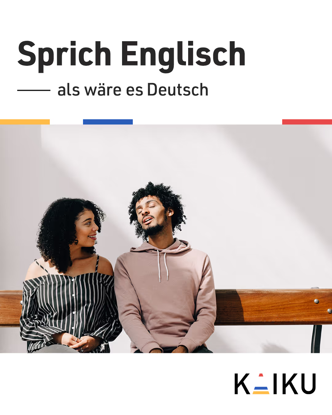
Bringing the Logo to Life
With insights from A/B testing and market research, we moved on to logo and visual design development. We defined three brand keywords: Empowering, Professional, and Trustworthy.
We kicked off the logo design process by sketching ideas on paper and exchanging feedback with the lead visual designer.
Through rounds of brainstorming and iteration, we developed a concept that symbolized the non-linear journey of language learning (a curving path), exploration (a flag), and new beginnings (opening curtains).
To make the logo bold and adaptable, we distilled these ideas into a clean, geometric form with a strong silhouette and distinctive color.

Curvy path

Shape of a flag

Stage curtains
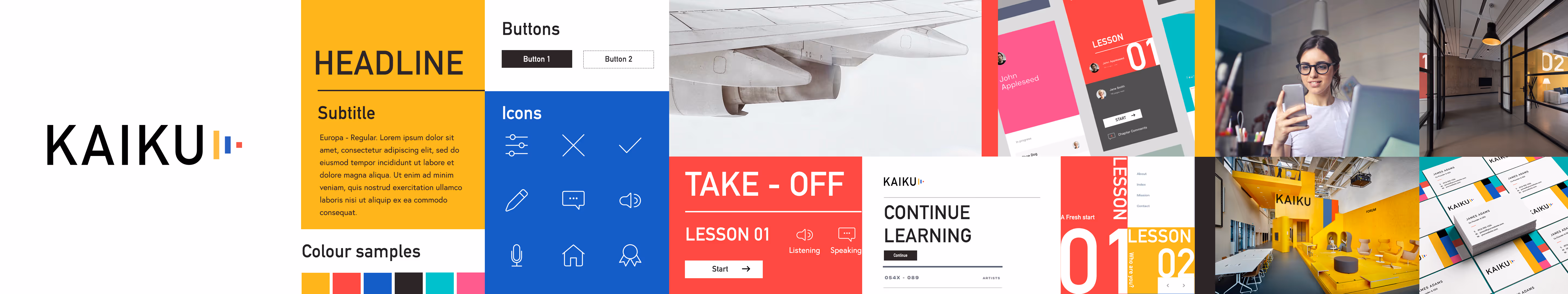
Graphic logo
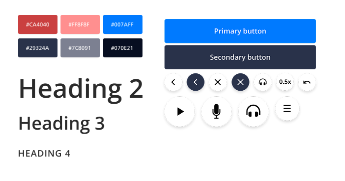
Brand Visual Style
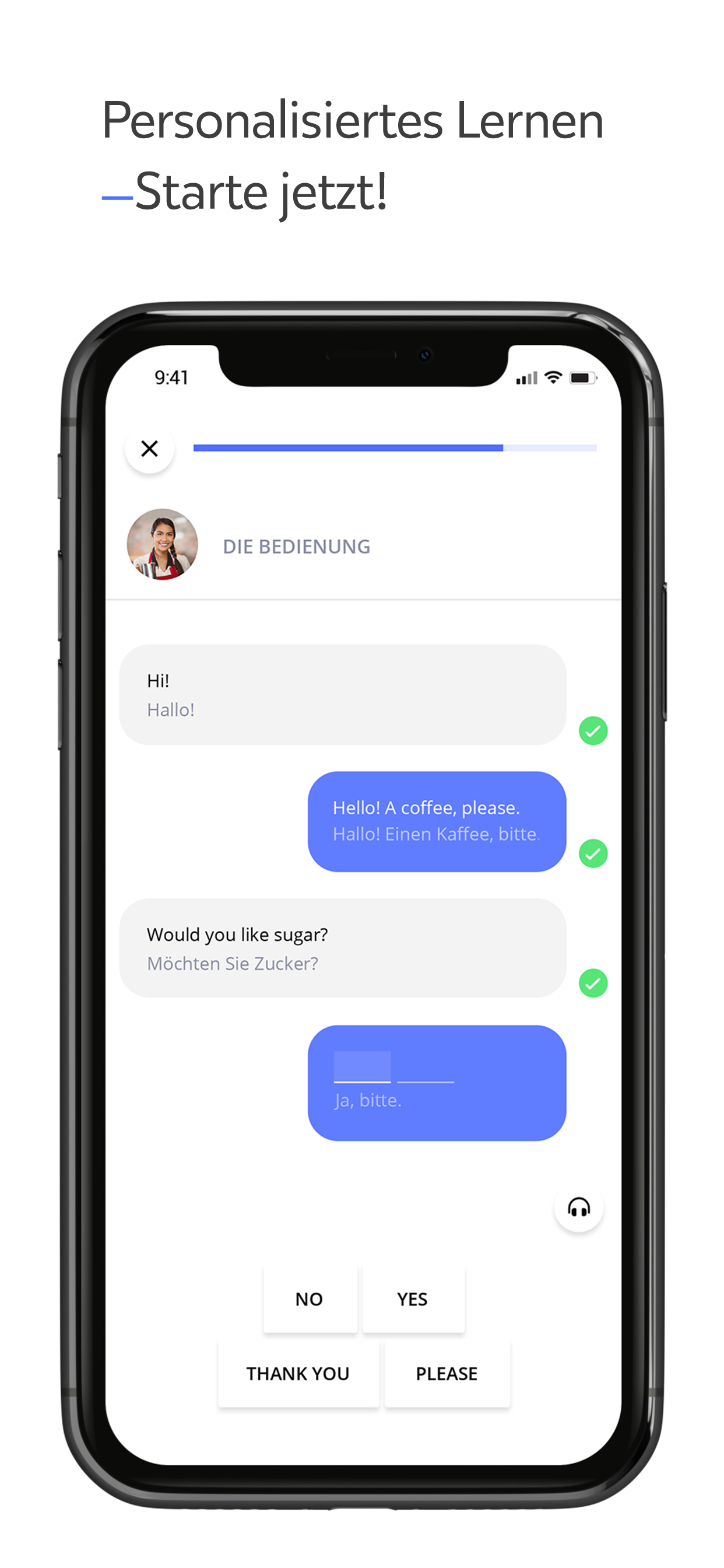
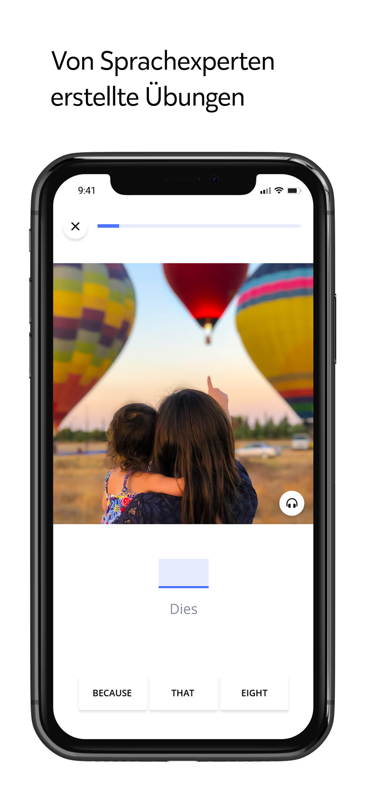
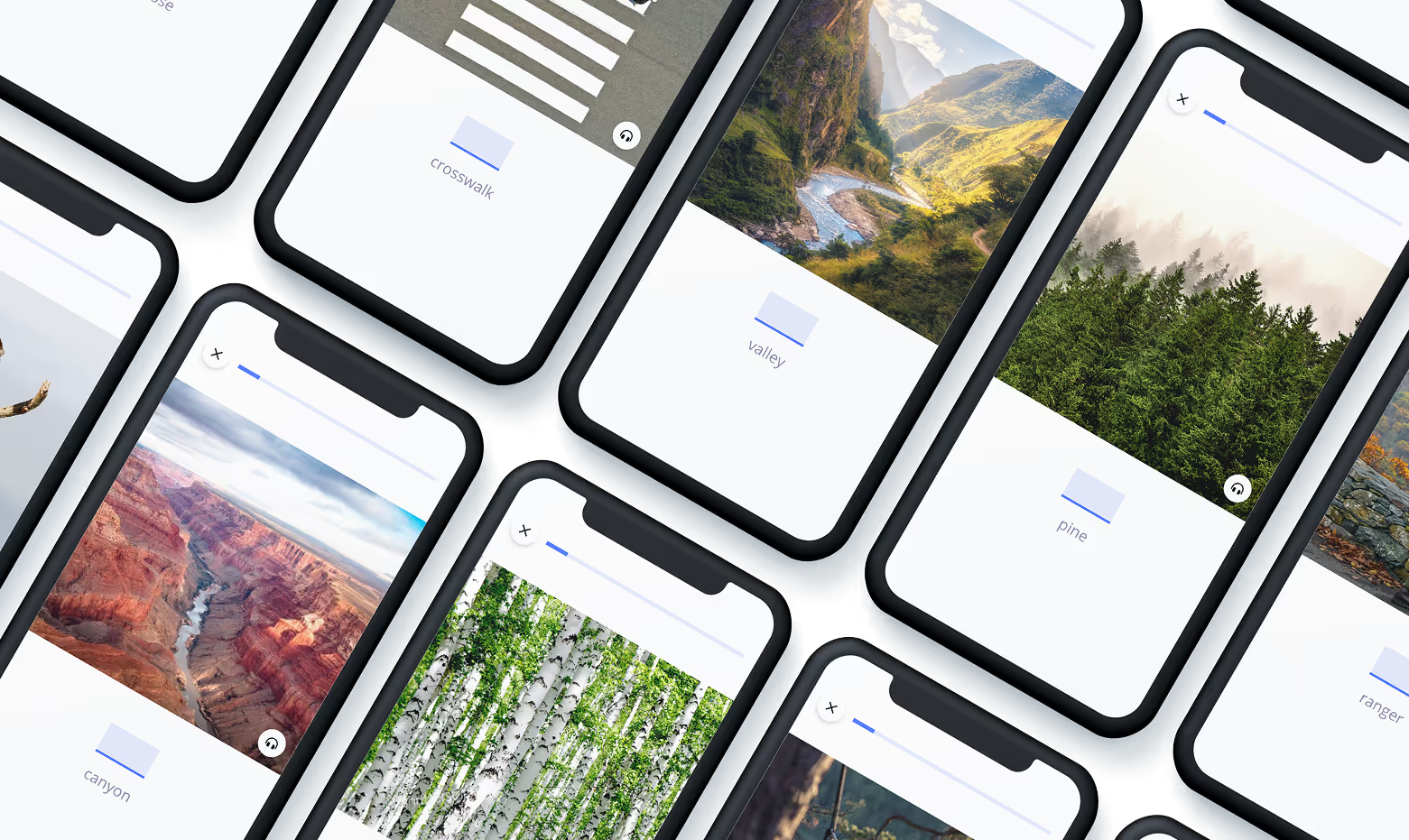
After multiple iterations and testing, we landed on a clean, minimal visual style.With the app relying heavily on images as study materials, a simple UI was essential, allowing the content to take center stage and creating a more focused, immersive learning experience.
Curating Consistency
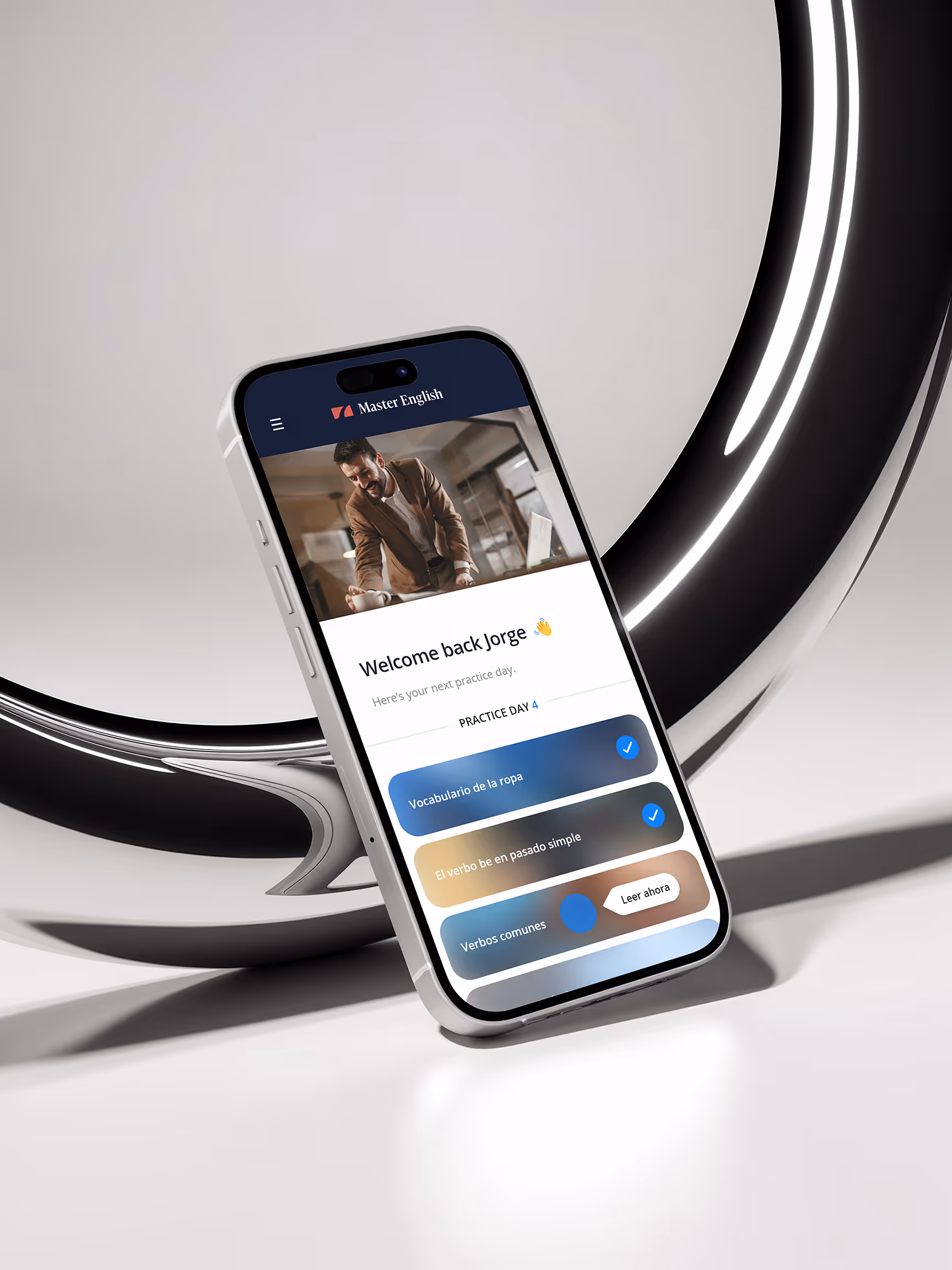
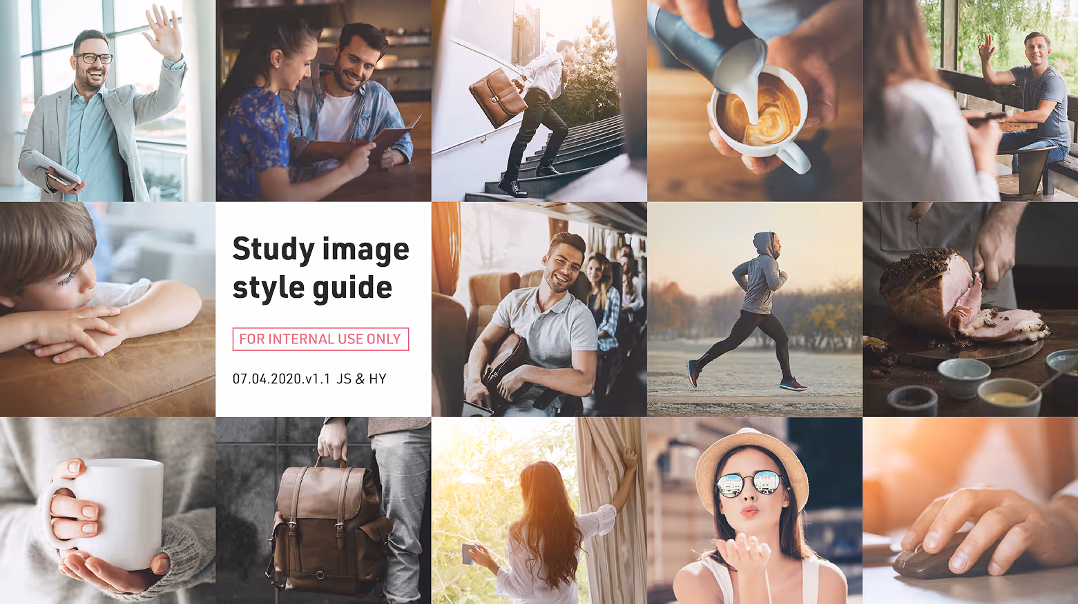
After creating the brand visuals, my responsibilities shifted to UI design for the app, designing new components for the design system, producing marketing materials, and selecting imagery for both promotional and learning content.
To maintain a consistent brand identity, I developed an internal style guide that defined the visual direction and ensured all imagery aligned with the brand’s tone and feel.
Today, the Master English app boasts a 4.9-star rating (24.8k reviews) on the App Store and a 4.8-star rating (22k reviews) on Google Play.
Designing Across Two Brands
After finalizing the brand visuals for Master English, I worked on UI design and marketing materials for both Master English and WordDive. These two products had very different brand identities, one minimal and professional, the other more playful and colorful. Managing both allowed me to adapt quickly between styles while maintaining consistency within each brand.
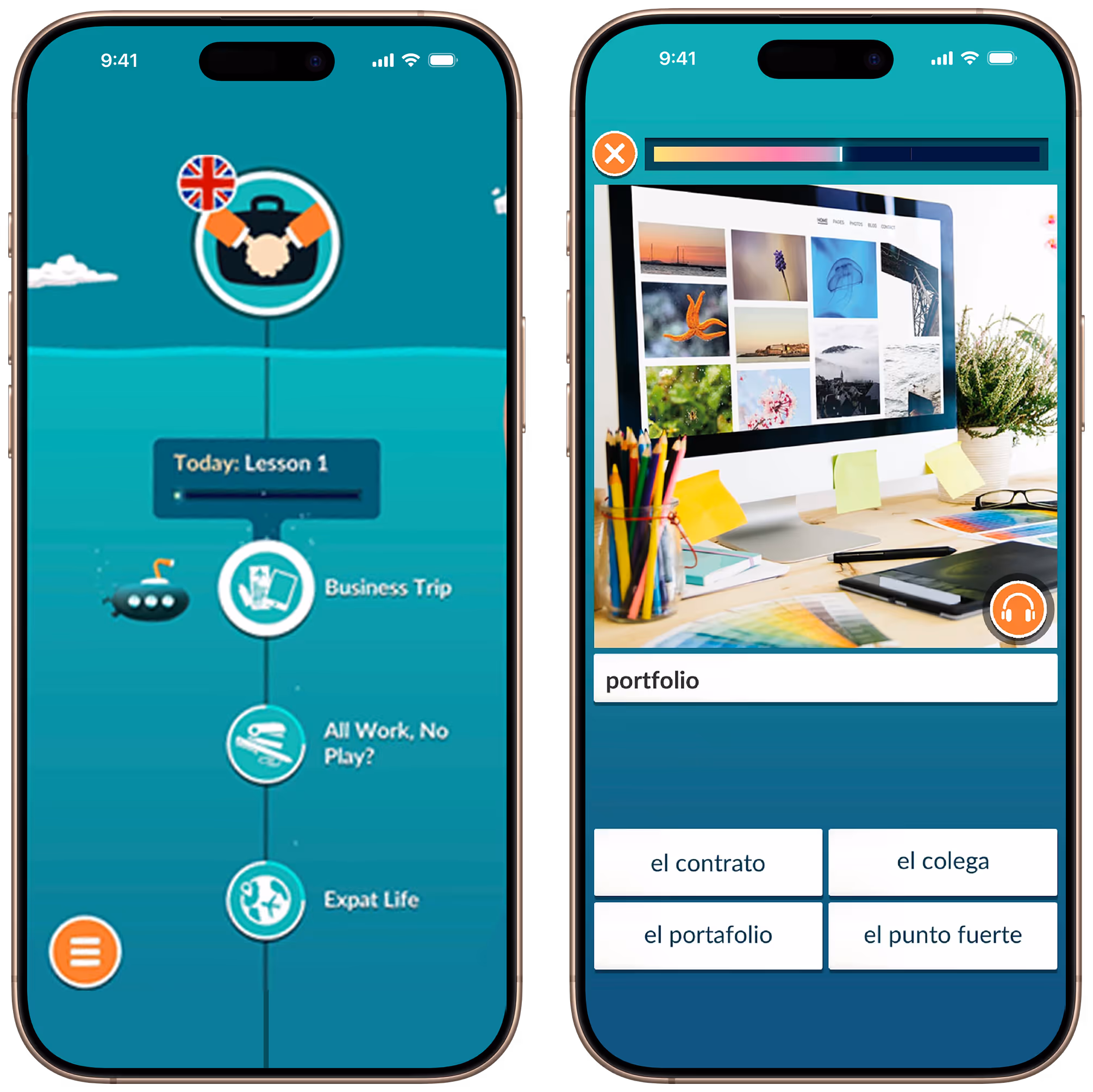
The WordDive app features a vibrant and playful brand aesthetic, with a UI that incorporates cartoonish elements and advertisements featuring a mascot named Mikko.
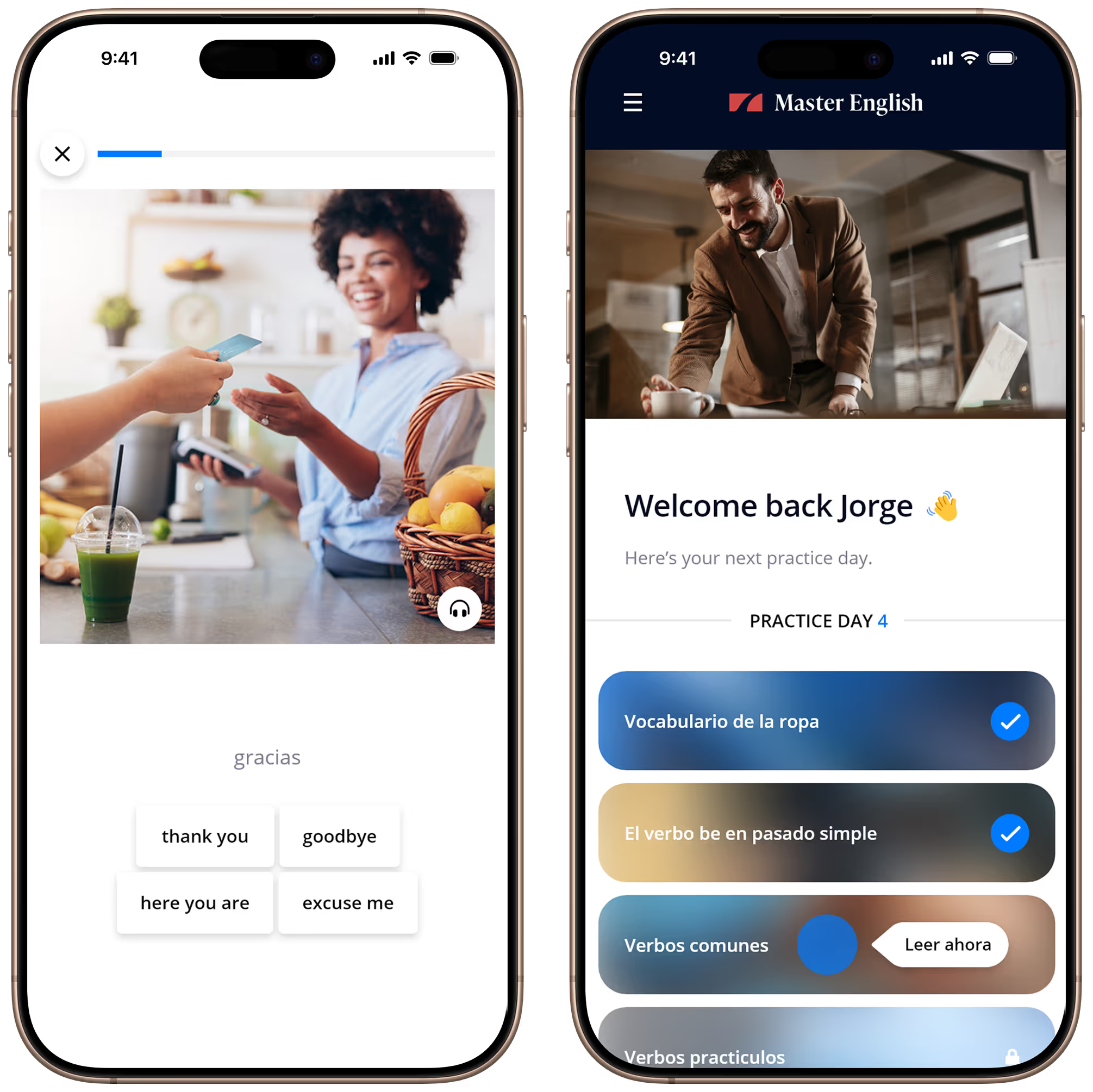
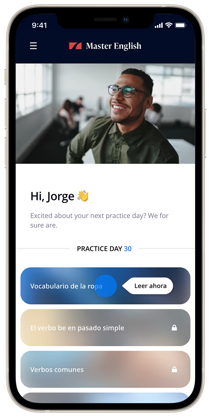
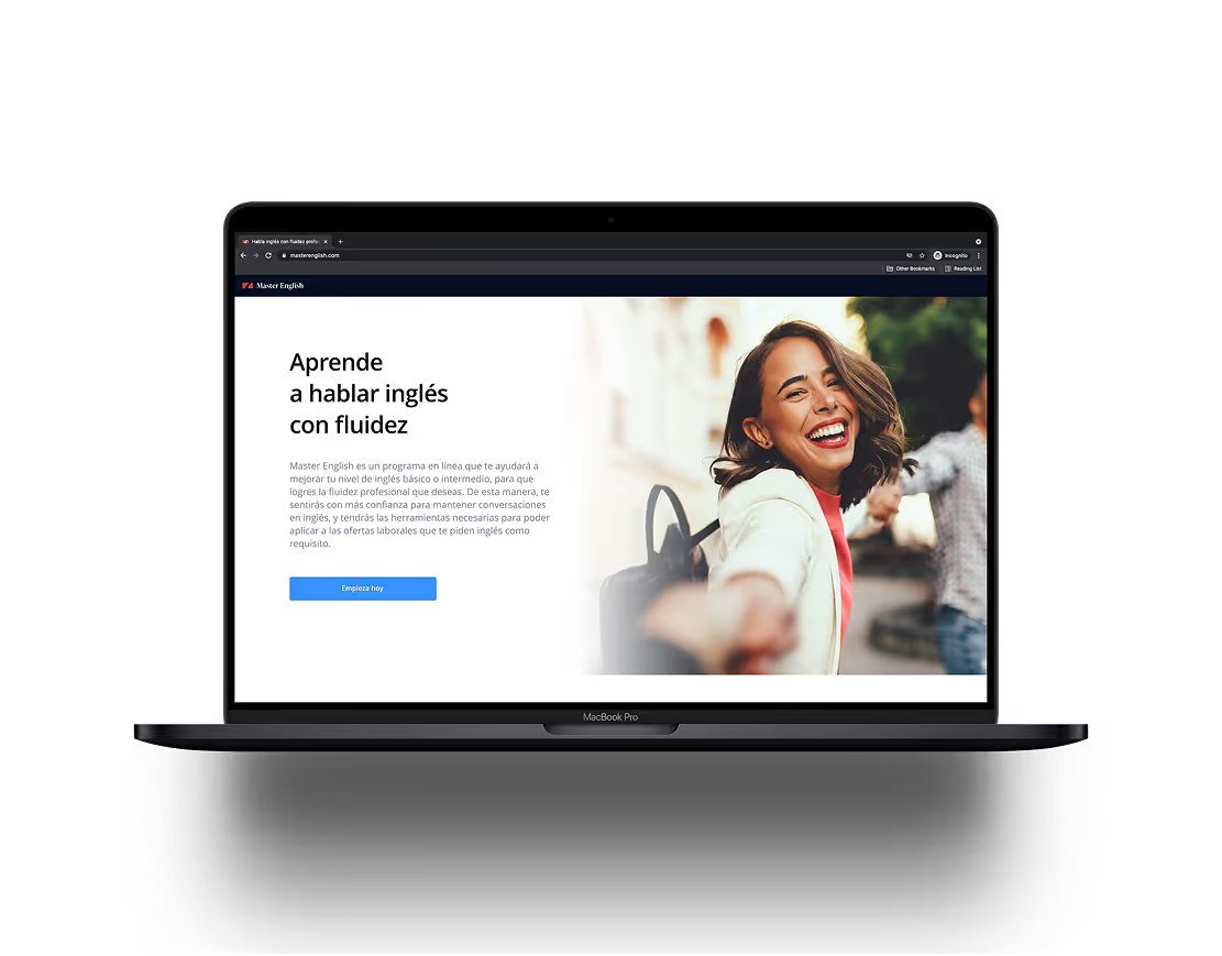
Master English features a sleek and professional UI. It incorporates high-quality images for a premium experience, showcasing visuals of diverse individuals.
Let’s work together
I specialize in digital product design, user interface and user experience, and collaborative product development for SaaS and B2C digital products. I believe design is about weaving human kindness into products and creating experiences that are intuitive, accessible, and meaningful.
Outside of work, I enjoy drawing, video games, tabletop RPGs, observing the cryptic behavior of my cats, and sculpting strange little monsters.
If you think I would be a good fit for your organization or have a project you’d like to collaborate on, please don’t hesitate to contact me!