


Seibun Design System
The beginning
I contributed to the update and overhaul of the design system used for the platform’s development at TELUS Digital. The platform went through several transitions and rebranding phases, which revealed that many components were outdated or no longer aligned with the TELUS Digital design language.
As part of the design team, I contributed to reviewing, updating, and refining selected legacy components to ensure visual and functional alignment with the new brand direction. I also collaborated closely with engineering during the rebuild to support consistency and structural improvements.
In addition to updating existing components, I created new ones when needed while designing features for the platform, ensuring the design system evolved in parallel with ongoing product development.
UI/UX design, Design Sytstem
Figma, Adobe Illustrator
Refining and Restructuring
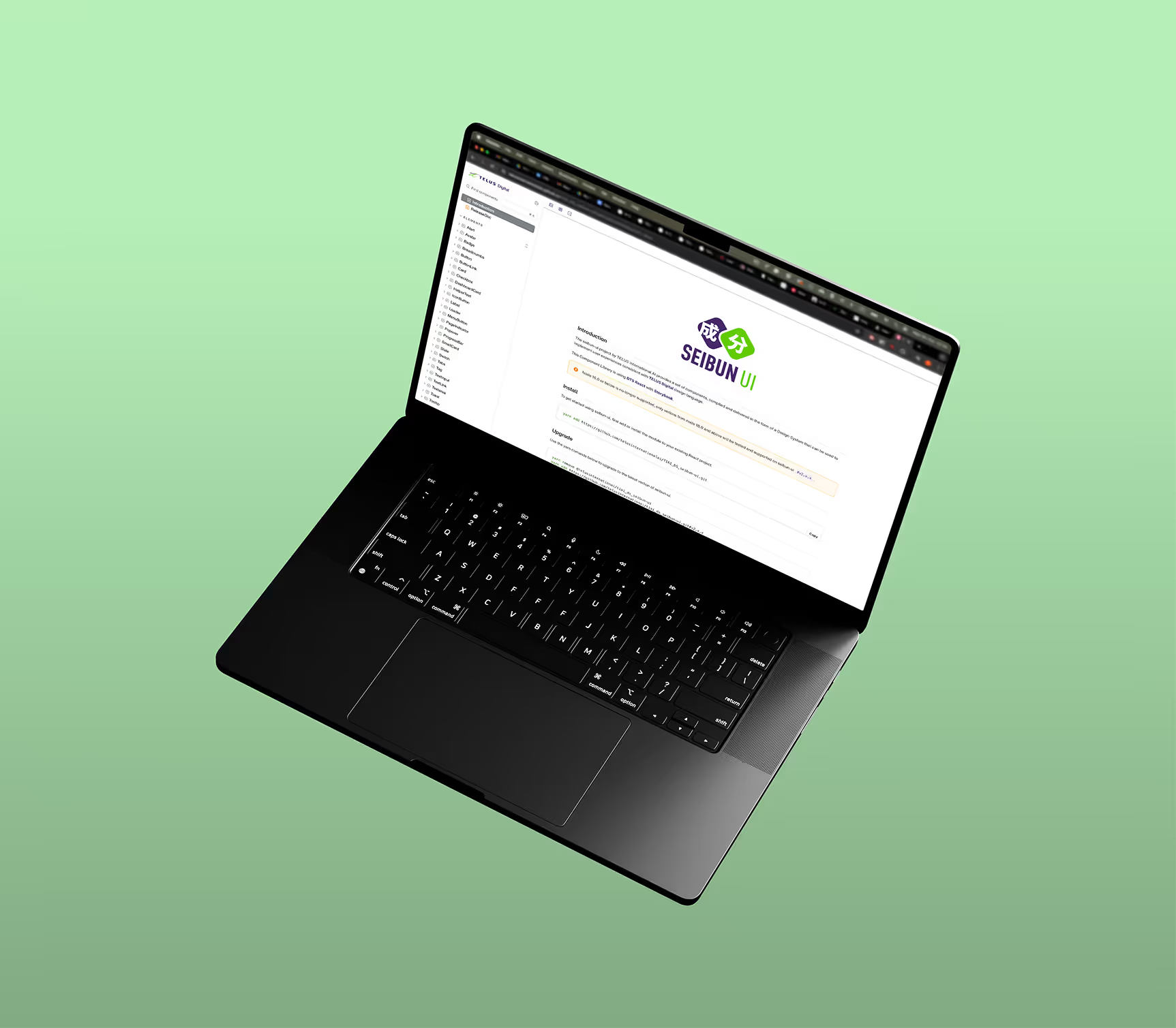
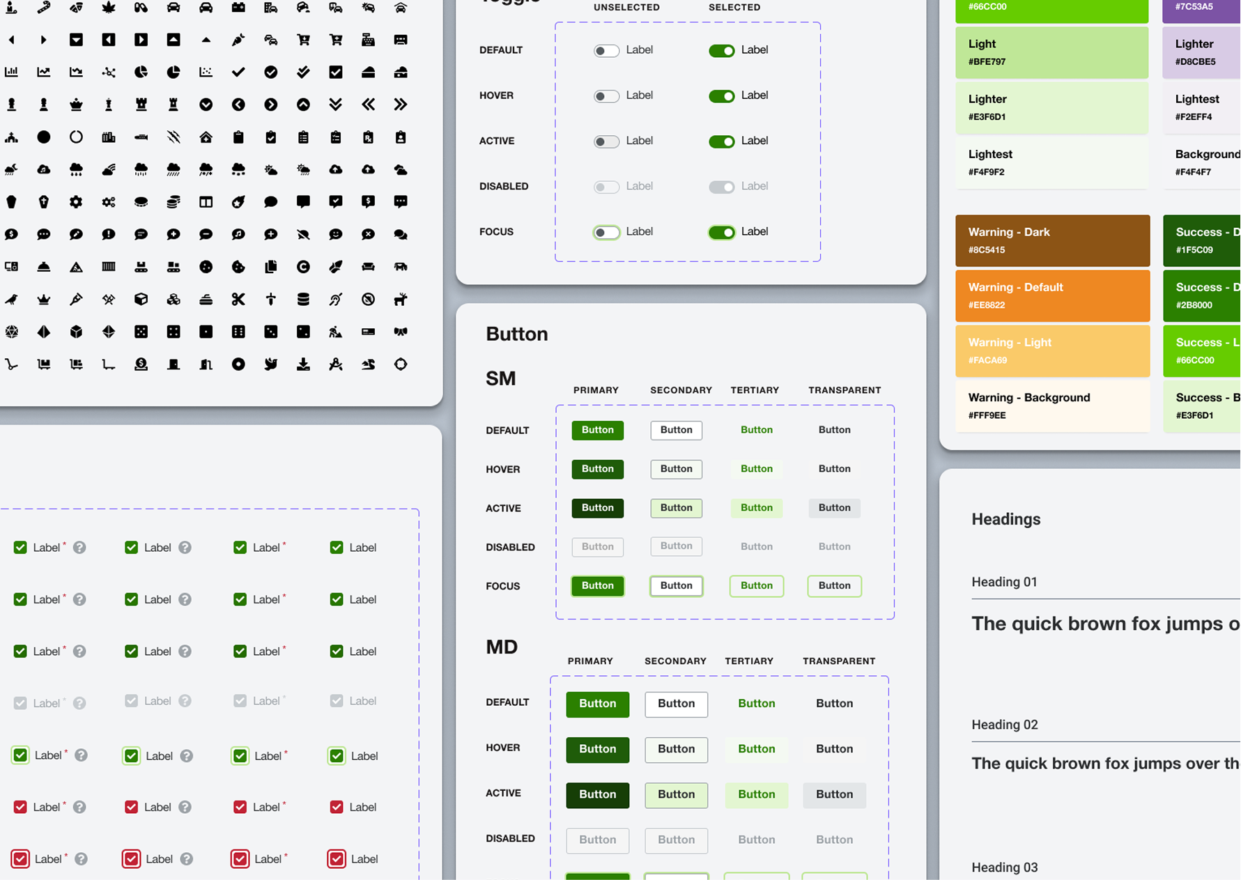
We benchmarked established design systems and, after discussions with the engineering team, chose Carbon Design, Dell Design System, and Material Design as our primary references. Tailwind was selected for implementation, and Storybook will serve as the platform for the Figma designs. We then categorized the Figma component files into six groups to facilitate organization.
Logo
Colors
Typography
Icons

Buttons
Text fields
Text areas
Checkboxes
Radio buttons
and more...

Cards
Panels
Tables
Badges
Avatars
and more...

Alerts
Tooltips
Popovers
Progress indicators
Empty states
and more...

Headers
Footers
Sidebars
Breadcrumbs
Navigation menus
and more...

Grid system
Breakpoints
Spacing
Section hierarchy
Avatars
and more...

Workflow
We organized weekly design system syncs with the engineering team to ensure alignment, facilitate quick feedback loops, and streamline implementation. Discussions in the Slack channel and ad-hoc review calls helped bridge gaps between meetings. When refining or creating new components, we followed these workflows:

Create a draft component in Figma, with behavioral examples or an interactive prototype.

Share with developers/designers in weekly design system meetings to validate feasibility and avoid redundancy.
Update based on feedback.
Add to Figma with usage guidelines and publish.
Share documentation with developers for integration into Storybook.
Benefit of design system
Leveraging the existing design system became a major advantage as I designed new features. Using brand-approved components helped me produce mid- to high-fidelity wireframes and interactive prototypes quickly, which was essential in a time-constrained project. It also allowed me to communicate more effectively with engineers by providing clear guidance on components, spacing, and expected behaviour.
Reworked and standardized components ensured visual coherence across flows, aligning the UI more closely with the evolving brand identity.
By defining each component’s usage and behaviour, we established consistent interaction and UI patterns that improved usability and reduced design drift.
Clear documentation enabled frontend developers to implement designs rapidly and helped new team members get up to speed with the system more quickly.
Having a reliable library of components made it easier to design new features and quickly draft higher-fidelity wireframes and prototypes.
Let’s work together
I specialize in digital product design, user interface and user experience, and collaborative product development for SaaS and B2C digital products. I believe design is about weaving human kindness into products and creating experiences that are intuitive, accessible, and meaningful.
Outside of work, I enjoy drawing, video games, tabletop RPGs, observing the cryptic behavior of my cats, and sculpting strange little monsters.
If you think I would be a good fit for your organization or have a project you’d like to collaborate on, please don’t hesitate to contact me!